


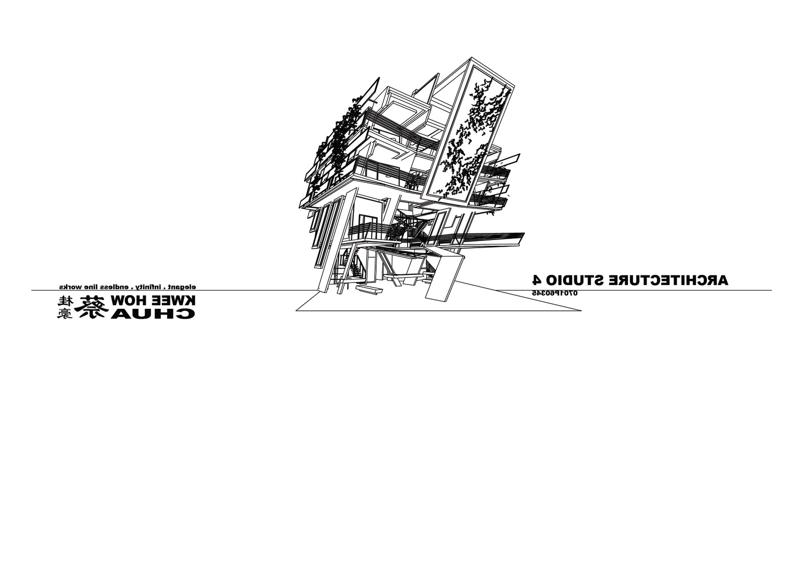
2009 Diploma Studio 4 projects

Project 1 : Design a pedestrian bridge - Petaling Street
CONCEPT - Spaces Transitioning
lighting.shadow.volume.

Project 2 : Tourism Launch Pad
 - Food Tourism
Given a task a Tourism Launch Pad which providing visit guide for the tourist also providing few accommodations for the tourists. Before designing, my group did a research about Malaysia had a great potential of food tourism. Visitors can enjoy the delicacy and travel, experience the culture or history behind the food.


my 1st post... just leave any comment ~ thx thx
-end-
7 comments:
First to comment,
there are too much text in the board. summarize in shorter and crucial phrases.
im quite fussy when it comes to explaning concepts. tilting the facade creates the best selling detail of the whole composition. however, saying that it is done "to show welcoming" requires a certain reference, like which object or building is successful by doing so.
"the concept of the tilting facade, is to attract the public, by visually drawing the eyes along the unconventional tilting lines into the interior. this is similar to the hierarchy of classical architecture, order of the columns to draw attention from bottom to top."
need to organize the things, eyes seem to got lost on their way trying to read about each thing (topics).
terrific rendering done at this level. get some other external perspectives, for instance i only saw one rendering showing your rear.
you have everything there, just need to organize them. i had crit for your pedestrian bridge before.
Cheers, thomas.
1) too much words
seriously, a picture speaks a thousand words. i believe this is your portfolio and not your presentation board. from experience, employers don't spend time reading your text. they will just flip n flip and flip. too much words is just over kill.
2) site context
you wrote your site context. even then also not clear enough. pictures, again, will do justice to your intellectual effort so much more.
clearly to some extend, you have considered site context (with that whole exposed idea).. but how does the building relates to it's neighbor.?
near my office is a GDP building called pj8. nice to see from the outside. as a stand-alone-non-place item it works so well. but then when i went closer.. found an infinity pool. over looking wat? - the adjacent 90s terrace houses with worn-out zinc roof sheets that, from that angle, looks like the slumps. what a view, isnt it? i baffled, cos after all the effort GDP put into the building they fail to notice this? clearly either the site was not studied well, or they didnt respond to site context.
the idea of exposing a building is meaningless without site context. it's a make or break thing. so clearly u have tot about it, so show it. =)
3) form development
seriously, it looks really post rationalized.. instead of trying to explain ur form thru a form "study" , i think it is much more worth while if u spent time explaining how u derived your 'exposure' at each point.. why is this perforated here , how does this relate to this thats why it,s shape here n so on.
if you're gonna use the concept "exposure" and u wanna use the whole form study thing as well.. u should approach it by asking "how does this form manipulation express 'exposure'?"
i sense the force of Bjark Ingels here again. he has his good points, but use them wisely.
i have more to say but i shall stop here..=)
kweehow can I say your skp modelling skill is already quite 出神入化?
well I think I can see someone's influence there..
I dun usually fancy futuristic forms but I think your pedestrian bridge is the most daring scheme I've seen from your studio. Forget about the context, it is extremely cool as an object.
Board is also extremely wordy, we wouldn't bother reading finish reading it, really.
haha thx fren
haha, really too wordy for my panel... when i doing dat time din realized got so many words. now see back... haha sux sux sux
btw.. thx ya
haha... fren i forgot to tell u the bridges is group work, like a chopstick u can break into half easily but in my group got 7 chopsticks...
(SABD fantastic 4 )
thanks for the crucial comments !!! i will try to make it better n better :)
yes i agree with the two of them.
you already have very competent graphic skills to put up a very stunning graphic presentation. so why bother about the words when you should've put more time into working out how to present graphically?
it's a matter of choice, make the best out of your potential when you can't be an all-rounder.
Post a Comment