Showing posts with label presentation tips. Show all posts

Monday, 27 April 2009

3 D MODEL

Dip Studio 3: Final Submission
As we announced at the tutorial last Thursday, you are required to submit

either A COMPUTER GENERATED 3D MODEL

or A PHYSICAL MODEL.

Naturally you are not forbidden from submitting both if you wish.

Wednesday, 15 April 2009

MOCK PRESENTATION

Dipl Studio 3: Presentation of Mock Final Panel, Thurs 16 April 2009.

Marking by tutors start at 1315h. Please pin up before that time.

You are to pin up a draft copy of ur final presentation panel. (We call this the "mock final panel".) The size of the mock panel should be at least half the size of the final panel.

The purpose of this exercise is to assess your PANEL DESIGN, to see how u intend to arrange, pigment and texture all your drawings, illustrations, selected minimal text, etc. to fully explain your scheme.

Obviously the content at this stage will be "whatever you have now". We know your design is still under progress.

Your final panel should comprise no less than 3 A1 sheets in one single banner. If you have enough content 4 A1 sheets make a better impression.

Your mock panel tomorrow will be an A3 version of the final panel. (A1 reduced by 50% gives u A3, rite?)

Friday, 28 November 2008

Presentation Board + Model tips


I was chatting with Ian on msn and these are few tips he gave me.

1. To compose a REALLY REALLY NICE board cos that will REALLY sell your scheme and get u the marks

2. choose ur BEST image and make that the biggest dominant image on the board. bleed it to 3 sides if u canit means like the image goes right to the edge of your board without borders

3. plans are important so they should be prominently placed and large enuf with just enuf essential info

4. make the plans punchy by putting in shadows. shadows should be v light to give a 3 d effect

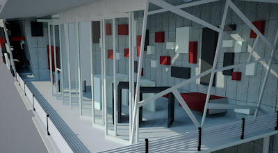
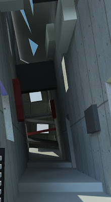
5. have a series of images taking ppl for a walk thru the building cos the ROUTE is v important in this project

6. u must put in the TEXTURAL QUALITIES in your bld to show what kind of textures ur bld materials r made of and always ask urself "Does this material have a texture? or is it just flat? flat and white? or has colour and shade? and good to touch?"

7. montage building to site - that's v important to show context how it fits in. with google earth don't make that too big. That can be a "SITE PLAN" 1: 300 OR 400 OR 500

8. HAVE a variety of scales of image parts. that's why it's important to plan ur board layout V V carefully. it's a MAKE OR BREAK situation

9. NO don't do detailed site model. that's to show form and space. to show relationship to site 1:500 and fit it into the Town model and photograph will do. show archtectonic element d at 1:100. 1:500 is blocky

10. nite shots usually more sexy than day shotsso go for it. your Main image can even be a nite shot and the overall colour tone of your board can be dark

11. you need to have A FEW image from inside looking outwards and if u can manage it make it a NIGHT AFTER THE RAIN image cos you'll get lots of nice reflections on wet surfaces

12. Minimum words. think hard about your DESIGN INTENTION and talk about ur design intention. a short "architect's statement" will do. as long as u have many captions, one for each image and illustration so that ppl will fully understand what ur trying to show on the board

13. sections usu work better if they are a bit bigger than plans. but u have to use ur discretion

14. u need to show some planting in ur scheme. to make it more "friendly, green, nice". try to make ur spaces flow into the outside green

15. Impt that u TEST PRINT tomorrow or ur colours and clarity make shock you

******
So..to all my studio mates...please keep ur sanity check always. I'm already goin insaneeeEE!


Wednesday, 26 November 2008

feedbacks n defences


Feedback from ian regarding the whole project statement & thingies:
" the overriding desire for transparency is ok, but the building must be buildable, u must b sure that it is structurally sound, and the amount of framing u use will be the thing that will be questioned. i mean it will have to relate to how much non-transparency it contributes, and sometimes "see all, all the time from anywhere" is not as interesting as "see some, see sometimes, see from somewhere, not everywhere" so that we will be enticed to want to see more and see again. it looks like you have a cross btw installation art and a landscape structure. That's ok if there's enough enclosure (enclosed spaces) where and if it is needed."
then...
ks says:
just read ur feedback

ks says:
ya.. the amount of framing does contributes to being some level of visual obstacle, so it's not actually 100% transparent because as u move around the building, the frames block ur vision at diff angles
ks says:
transparency is achieved by not having immediate walls etc, but doesnt mean there's no visual obstacle that is formed further away from the spaces
ks says:
so there is this quality of see some, see sometimes, see at different angles
ks says:
anyway, a couple of non-transparent enclosed programes do exist in here.... the toilet m&e and gallery(half half but definitely not letting the public to see it through) la....
endorphIAN says:
ok, as long as u understand the value of opacity and translucency for visual purposes
endorphIAN says:
and acoustic separation where required and desired
endorphIAN says:
so that you have a variety of spaces in terms of acoustic as well as physical privacy
endorphIAN says:
and also try to have an overlay or merging of "off-xyz" axes
endorphIAN says:
onto the xyz axis of your frames
ks says:
there is... a little bit
endorphIAN says:
so that it has an element of escape from the "restrictiveness" of the frames
endorphIAN says:
little bit may not be enough to make a statement
endorphIAN says:
may be a bit too static
ks says:
yeah ... but i've never really wanted to do that, though i understand it's effect
ks says:
because i tot i've already made the frames tranforming, so there may not need to hav the opposite element transforming like that again
ks says:
else i'd question myself what is the active n wut is the passive.
ks says:
so.. it's kind of contradicting if both tries to escape from one another
endorphIAN says:
you odi have curves which gets away from xyz
endorphIAN says:
you can take that further and let the curves actually slither away from the xyz in a more definite way
endorphIAN says:
there can be multilayers of msg
endorphIAN says:
sometimes u can't be too subtle
endorphIAN says:
cos it may get too cerebral
endorphIAN says:
and the children of lesser gods dun get it
that's bout it, just don't forget that we have to consider ourselves presenting to a range of ppl from primary school kids to Norman Foster, and make them all understand! darn it's hard..
Good luck

Thursday, 30 October 2008

PUBLIC SPEAKING

...practise your speaking skills to get you on the road to success.

  • Join Toastmasters International (TMI)

  • Relax and Pause

  • Discard Outdated Tips

  • Breathe Correctly

  • Smile (....helps you think by releasing endorphins into your brain..)

  • Keep it Simple

  • Open with Pizzazz and Close with a Punch

  • Talk the Walk You Walk

(for full article, see today's Star Metro Classifieds cover, "TALK YOUR WAY TO THE TOP", by Michael A. Podolinsky, a master trainer specialising in developing passionate leaders.

Also check out my previous postings, "PRESENTATION CONFIDENCE" and "PRESENTATION LANGUAGE" in April this year.)