Friday, 28 November 2008

Presentation Board + Model tips


I was chatting with Ian on msn and these are few tips he gave me.

1. To compose a REALLY REALLY NICE board cos that will REALLY sell your scheme and get u the marks

2. choose ur BEST image and make that the biggest dominant image on the board. bleed it to 3 sides if u canit means like the image goes right to the edge of your board without borders

3. plans are important so they should be prominently placed and large enuf with just enuf essential info

4. make the plans punchy by putting in shadows. shadows should be v light to give a 3 d effect

5. have a series of images taking ppl for a walk thru the building cos the ROUTE is v important in this project

6. u must put in the TEXTURAL QUALITIES in your bld to show what kind of textures ur bld materials r made of and always ask urself "Does this material have a texture? or is it just flat? flat and white? or has colour and shade? and good to touch?"

7. montage building to site - that's v important to show context how it fits in. with google earth don't make that too big. That can be a "SITE PLAN" 1: 300 OR 400 OR 500

8. HAVE a variety of scales of image parts. that's why it's important to plan ur board layout V V carefully. it's a MAKE OR BREAK situation

9. NO don't do detailed site model. that's to show form and space. to show relationship to site 1:500 and fit it into the Town model and photograph will do. show archtectonic element d at 1:100. 1:500 is blocky

10. nite shots usually more sexy than day shotsso go for it. your Main image can even be a nite shot and the overall colour tone of your board can be dark

11. you need to have A FEW image from inside looking outwards and if u can manage it make it a NIGHT AFTER THE RAIN image cos you'll get lots of nice reflections on wet surfaces

12. Minimum words. think hard about your DESIGN INTENTION and talk about ur design intention. a short "architect's statement" will do. as long as u have many captions, one for each image and illustration so that ppl will fully understand what ur trying to show on the board

13. sections usu work better if they are a bit bigger than plans. but u have to use ur discretion

14. u need to show some planting in ur scheme. to make it more "friendly, green, nice". try to make ur spaces flow into the outside green

15. Impt that u TEST PRINT tomorrow or ur colours and clarity make shock you

******
So..to all my studio mates...please keep ur sanity check always. I'm already goin insaneeeEE!


Wednesday, 26 November 2008

feedbacks n defences


Feedback from ian regarding the whole project statement & thingies:
" the overriding desire for transparency is ok, but the building must be buildable, u must b sure that it is structurally sound, and the amount of framing u use will be the thing that will be questioned. i mean it will have to relate to how much non-transparency it contributes, and sometimes "see all, all the time from anywhere" is not as interesting as "see some, see sometimes, see from somewhere, not everywhere" so that we will be enticed to want to see more and see again. it looks like you have a cross btw installation art and a landscape structure. That's ok if there's enough enclosure (enclosed spaces) where and if it is needed."
then...
ks says:
just read ur feedback

ks says:
ya.. the amount of framing does contributes to being some level of visual obstacle, so it's not actually 100% transparent because as u move around the building, the frames block ur vision at diff angles
ks says:
transparency is achieved by not having immediate walls etc, but doesnt mean there's no visual obstacle that is formed further away from the spaces
ks says:
so there is this quality of see some, see sometimes, see at different angles
ks says:
anyway, a couple of non-transparent enclosed programes do exist in here.... the toilet m&e and gallery(half half but definitely not letting the public to see it through) la....
endorphIAN says:
ok, as long as u understand the value of opacity and translucency for visual purposes
endorphIAN says:
and acoustic separation where required and desired
endorphIAN says:
so that you have a variety of spaces in terms of acoustic as well as physical privacy
endorphIAN says:
and also try to have an overlay or merging of "off-xyz" axes
endorphIAN says:
onto the xyz axis of your frames
ks says:
there is... a little bit
endorphIAN says:
so that it has an element of escape from the "restrictiveness" of the frames
endorphIAN says:
little bit may not be enough to make a statement
endorphIAN says:
may be a bit too static
ks says:
yeah ... but i've never really wanted to do that, though i understand it's effect
ks says:
because i tot i've already made the frames tranforming, so there may not need to hav the opposite element transforming like that again
ks says:
else i'd question myself what is the active n wut is the passive.
ks says:
so.. it's kind of contradicting if both tries to escape from one another
endorphIAN says:
you odi have curves which gets away from xyz
endorphIAN says:
you can take that further and let the curves actually slither away from the xyz in a more definite way
endorphIAN says:
there can be multilayers of msg
endorphIAN says:
sometimes u can't be too subtle
endorphIAN says:
cos it may get too cerebral
endorphIAN says:
and the children of lesser gods dun get it
that's bout it, just don't forget that we have to consider ourselves presenting to a range of ppl from primary school kids to Norman Foster, and make them all understand! darn it's hard..
Good luck

Monday, 24 November 2008

google sketch up 7

this the latest sketch up from google, i just got it from one forum, i download it, try it and don't feel any different,except the color scheme is lil bit different,and they claimed that the latest sketch up had some kind of magic when we try to rescale the window, but it turn quite annoying to me. i must download everysingle thing from the net.

but basically i'm not a big fan of 3d thingy,so i'm not really into it, i prefer my skecth book.and for the vray plugin, u still need ur sketch up pro 6,because they don't had it in 7.

link http://rapidshare.com/files/165194865/GoogleSketchUpProWEN.rar

just want to share....

guys, i got a link for and architecture e-book from one forum. it's quite a lot,and maybe take sometime to download everything.

i already download some,and it quite interesting for me.

http://rapid*share.com/files/81655737/0750658495.rar
http://rapid*share.com/files/81655482/0750659025.rar
http://rapid*share.com/files/81657974/0750660899.rar
http://rapid*share.com/files/81657337/0750661429.rar
http://rapid*share.com/files/81657198/0750661755.rar
http://rapid*share.com/files/81656863/0750666285.rar
http://rapid*share.com/files/81656499/0750668180.rar
http://rapid*share.com/files/81656152/9780750664486.rar
http://rapid*share.com/files/81659554/9780750659345.rar
http://rapid*share.com/files/81659187/0750665440.rar
http://rapid*share.com/files/81658820/0750665270.rar
http://rapid*share.com/files/81658445/0750664584.rar
http://rapid*share.com/files/81658298/0750662077.rar
http://rapid*share.com/files/81660361/0750658320.rar
http://rapid*share.com/files/81660879/0750657642.rar
http://rapid*share.com/files/81663699/0750657294.rar
http://rapid*share.com/files/81663548/0750656050.rar
http://rapid*share.com/files/81663409/0750655437.rar
http://rapid*share.com/files/81662912/0750654260.rar
http://rapid*share.com/files/81662544/0750654252.rar
http://rapid*share.com/files/81662012/0750653590.rar
http://rapid*share.com/files/81661419/0750653434.rar
http://rapid*share.com/files/81661302/0750651644.rar
http://rapid*share.com/files/81667163/0750648481.rar
http://rapid*share.com/files/81665755/0750642734.rar
http://rapid*share.com/files/81665570/0750632755.rar
http://rapid*share.com/files/81665277/0750640820.rar
http://rapid*share.com/files/81664945/075065385X.rar
http://rapid*share.com/files/81664413/075065693X.rar
http://rapid*share.com/files/81664016/0271029773.rar
http://rapid*share.com/files/81666862/075065130X.rar
http://rapid*share.com/files/81667611/0750666579.rar
http://rapid*share.com/files/81667630/0750658975.rar
http://rapid*share.com/files/81668486/0750657170.rar
http://rapid*share.com/files/81670999/0750656530.rar
http://rapid*share.com/files/81669386/0750655119.rar
http://rapid*share.com/files/81668934/0750654503.rar
http://rapid*share.com/files/81668515/0750653728.rar
http://rapid*share.com/files/81670772/0750652462.rar
http://rapid*share.com/files/81671536/0750649488.rar
http://rapid*share.com/files/81672521/0750649046.rar
http://rapid*share.com/files/81673131/0750648902.rar
http://rapid*share.com/files/81674334/0750647930.rar
http://rapid*share.com/files/81674477/0750647701.rar
http://rapid*share.com/files/81675434/0750641029.rar

just delate the * in between rapid and share, and you can download it.
hopefully my act is legal to share it with you,if it illegal or not appropriate just tell me i'll delete it, or you guys can delete it...

Monday, 10 November 2008

Need comments/help, guys!!

Site: opposite of clock tower

Design Statement:
  1. guide visitors in a spiral circulation.
  2. Smooth flow
material: steel and glass
Need helps....................................
I am tend to take over 5 shop lots but demolish 3 only. The leftover is for the public area: cafeteria and souvenir shop. Area of each shop is 4.5 m x 19m. Is it possible for me to do so? Design idea is shown as below:


Top view


View from the clock tower


Section

THE STAR IN EGYPT


http://thestar.com.my/education/story.asp?file=/2008/11/9/education/2430926&sec=education

An excellent account by Anne Barbosa, as witty as it is comprehensive; and good insights, too, by Ashley Leong, Marcus Cheh, Ahmed Arizz Azhar, Shaira Najia Jamil, Saw Jia Jin, and Raja Imran (in the links.)

Sunday, 9 November 2008

LIGHT, SPACE, ROUTE

Image on Blender software by Mark Huang (c) with permission.

Project2 : Visitor Centre (submission program)

Project: Visitor Centre
Submission date: Mon (1 Dec 2008)
Venue: Studio2 (lvl 8)
Submission time: 1pm - 2pm
Setting up Exhi/reviews: 2pm - 3pm

3 X A1 potrait layout

-plans(s) + sections @ 1:100 (must include site surrounding)
-photo montage of your design in the surrounding context
-a series of perspectives narrating the "route" in your design. (should include how user engage with the space, light/shadow, materiality, inside/outside relationship)
-thumbnails showing the site response + design process.
-1 model (physical 1:100 & comp. generated)

____________________________________________________________________
Portfolio submission
(+ cdrom of complete works)
Submission (Wednesday) 3 Dec
Format (6(2) xA3) (add a page for project 1 or 2 if needed)
Time 1pm - 2pm
____________________________________________________________________
Design Review 2 Dec/Tues
Venue: Studio 2+3 (9am)
____________________________________________________________________
!!! STUDY WEEK SUBMISSION !!! (12 Nov / Wed)
Draft MockUp: 3x A1
Time: 9:30 - 12:00 am

Thursday, 6 November 2008

to learn ... the solid, void, space.... light, shadow, to make a building a building

Red is noted for highlight.

jsopeh says:
(if u get back and read this msg) uhm... could u explain me a brief difference between light and spaces (of the solids and voids)? because it seems to spaces and light are so closely related it troubles me to split their differences. i cant seem to separate and do a light experiential feeling without creating that space which channeled the light. its quite troubling to discover that. >< ! jsopeh says: all i understand so far is . without the solids n voids i cannot create any light experience basically because theres nothing to channel it with. but . what makes their difference if i were to take one of them away? endorphIAN says: solids are v deceptive things endorphIAN says: like the solid and void series u posted on blog endorphIAN says: we choose to name the spaces between the blocks "voids" endorphIAN says: cos we walk into them endorphIAN says: and we assume the other "closed box bits" are "solids" endorphIAN says: but that's just a the way we've chosen to draw a demonstration of what we understand as space endorphIAN says: we are trying to "capture" space in a "thumbnail" sketchup way endorphIAN says: if u were to draw "interior perspective" sketches instead, then we won't need to use those blocks of yours endorphIAN says: we would be drawing from a human-in-the-space point of view endorphIAN says: instead of from a God-in-heaven-looking-down point of view jsopeh says: (but i could've just zoomed in for that effect. wouldn't it be the same ?) endorphIAN says: yes and no endorphIAN says: that's where the trick is endorphIAN says: no human eye can see like God endorphIAN says: haha...that sounds so funny jsopeh says: hahah but.... its just the way we plan . we see it from above. (im supposing it would make a big difference if i designed everything from a eye level point of view)
endorphIAN says:
or, practically, the usual normal bld user experience is from the "interior perspective" point of view
endorphIAN says:
yes
endorphIAN says:
so u see, why we (boring tutors) don't often seem so excited when we see u guys designing from sketchup
endorphIAN says:
lol
endorphIAN says:
that's because it's v divorced from the down-to-earth experiential approach we're all after
endorphIAN says:
From up there, or sketchup there, it's all ocular---visual experience
endorphIAN says:
From down and in there, it can be more---all five senses, almost
endorphIAN says:
So, coming back to your solids and voids..
endorphIAN says:
From down & in (d&i) there you don't really need those massive blocks to enclose your spaces
endorphIAN says:
walls would do
endorphIAN says:
like, compare the pyramids with the Alexandria Library
endorphIAN says:
Don't u think so
jsopeh says:
hmmm ... but .... the pyramids had its own idea of ... mass and weight didnt it ? (though it was really the technology which limited them in)
endorphIAN says:
it was the tech and other considerations like permanence, security against intrusion, desire for height, monumentality, etc.
endorphIAN says:
but in terms of SPACE, it's like what i just said
endorphIAN says:
so back to your s & v
endorphIAN says:
your solids are not necessarily solid, rite
endorphIAN says:
they could be empty boxes
endorphIAN says:
which means they r spaces enclosed by planes
endorphIAN says:
which means they're not much different from your other "spaces in btw the solids"
endorphIAN says:
still following ?
jsopeh says:
yup
jsopeh says:
but one thing
right now . i get the point u're trying to make is . having a BIG solid.... and having a wall would create the same effect in spatial understanding.
jsopeh says:
so . why the size of solids in some designs ?
endorphIAN says:
right
endorphIAN says:
why indeed
endorphIAN says:
that u have to find out
jsopeh says:
haha !
endorphIAN says:
but for us now, we need to see how this discussion helps us
endorphIAN says:
ur next understanding is that therefore in composing those experiential spaces you posted
endorphIAN says:
you have, in actual built reality, an absolutely wonderful
endorphIAN says:
SECONDARY series of spaces, like supporting spaces to your main players
endorphIAN says:
which you, as the designer, need to orchestrate into the overall composition
endorphIAN says:
so that we get rhyme and rhythm and mystery and surprises
endorphIAN says:
and modulations of space and developments in character as you
endorphIAN says:
traverse the interior on an intentional and organised ROUTE
endorphIAN says:
and that basically is what designing a bld is all about.
endorphIAN says:
the EFFECT of decon is only an architectonic means to produce a certain character for your spaces in this line of thought.
endorphIAN says:
(Decon is more than that)
jsopeh says:
haha. i do see
endorphIAN says:
The other main issue u have is about light and space
jsopeh says:
yup
endorphIAN says:
Yes, without light we can't perceive the fullness of space
endorphIAN says:
I say "fullness" cos a blind person can still feel space
endorphIAN says:
by touch
endorphIAN says:
but not to the full extent a seeing person can
endorphIAN says:
so for practical purposes you may want to start by composing the space in physical dimensions or proportions
endorphIAN says:
v much in the way you've done on blog
endorphIAN says:
and then see how you can bring light in at those particular points
endorphIAN says:
or in that particular way to further accentuate the character that you have intended with the space
endorphIAN says:
i'm digesting my oats, that's why i can't sleep just yet
endorphIAN says:
lucky u
jsopeh says:
hm ... but to me . light only seems as one thing . "hope" and thats still so ..... symbolic
jsopeh says:
that whole .. hope n faith and .... god . and ... luck
jsopeh says:
uknow . the usual ! i dont see further than that
jsopeh says:
(haha . well very lucky me then)
endorphIAN says:
yeah, it's all that
endorphIAN says:
and more
endorphIAN says:
there's the function bit
endorphIAN says:
u need light to see la
endorphIAN says:
all this symbolism....it'll soon find it's balance with other stuff
endorphIAN says:
and i think this particular slant comes from not seeing/experiencing enough of architectural spaces first hand
endorphIAN says:
and merely thinking about it
endorphIAN says:
it gets v cerebral
endorphIAN says:
(pallasma)
endorphIAN says:
reading is not enough
endorphIAN says:
you need to go and BE in there with all your senses alive
jsopeh says:
what if ur feeling of it ... isnt the same as others? what happens then ? don't u fail to translate?
endorphIAN says:
well, you have to test it
endorphIAN says:
go out with your gang
endorphIAN says:
to various blds
endorphIAN says:
and discuss your emotional resposes with each other
endorphIAN says:
you'd be surprise at the commonality
endorphIAN says:
*responses

For pictures... refer to diagrams post
Wednesday, 5 November 2008

Spatial feelings

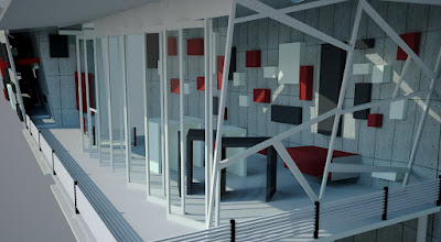
Here's something Joseph came up with. "I'm going mad with ideas!", said Joseph. Comments and feedbacks are greatly appreciated.

ADHOCISM @ FINDING PHARAOH

The Lecture, 'FINDING PHARAOH' Impressions From Egypt, was delivered this morning along with presentations by Studio 3 students on their Design Intentions for their Commemorative Centre for Taiping and with a briefing by Ms V on Portfolio Strategies.


Some in the audience applied the theory of Adhocism to handle the marathon session. (Thankfully it wasn't during my lecture!)

Definition of Adhocism in Architecture and illustration follows.

Notions of ‘Adhocism’ were coined by architectural designer, theorist, and sometime designer Charles Jencks and Nathan Silver in their book Adhocism: The Case for Improvisation (1972). They considered the ways in which designers could take immediate action through the use of readily available components in ways that had never been conceived in their original design.

(Posted with permission from, and with thanks to, the performer.)