Sunday, 28 September 2008

ACE, BABY !

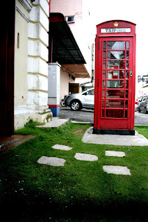
Now, why don't we think like that for our Taiping Visitor Centre...hehe..

(following email received today from bhy, with thanks.)

Physics exam
a true story
The following concerns a question in a physics degree exam at the University of Copenhagen:

"Describe how to determine the height of a skyscraper using a barometer."

One student replied:

"You tie a long piece of string to the neck of the barometer, then lower the barometer from the roof of the skyscraper to the ground.

The length of the string plus the length of the barometer will equal the height of the building."

This highly original answer so incensed the examiner that the student was failed.

The student appealed on the grounds that his answer was indisputably correct, and the university appointed an independent arbiter to decide the case.

The arbiter judged that the answer was indeed correct, but did not display any noticeable knowledge of physics.

To resolve the problem it was decided to call the student in and allow him six minutes in which to provide a verbal answer which showed at least a minimal familiarity the basic principles of physics.

For five minutes the student sat in silence, forehead creased in thought.

The arbiter reminded him that time was running out, to which the student replied that he had several extremely relevant answers, but couldn't make up his mind which to use.

On being advised to hurry up the student replied as follows:

"Firstly, you could take the barometer up to the roof of the skyscraper, drop it over the edge, and measure the time it takes to reach the ground.

The height of the building can then be worked out from the formula H = 0.5g x t squared. But bad luck on the barometer."

"Or if the sun is shining you could measure the height of the barometer, then set it on end and measure the length of its shadow.

Then you measure the length of the skyscraper's shadow, and thereafter it is a simple matter of proportional arithmetic to work out the height of the skyscraper."

"But if you wanted to be highly scientific about it, you could tie a short piece of string to the barometer and swing it like a pendulum, first at ground level and then on the roof of the skyscraper.

The height is worked out by the difference in the gravitational restoring force T = 2 pi sq root (l / g)."

"Or if the skyscraper has an outside emergency staircase, it would be easier to walk up it and mark off the height of the skyscraper in barometer lengths, then add them up."

"If you merely wanted to be boring and orthodox about it, of course, you could use the barometer to measure the air pressure on the roof of the skyscraper and on the ground, and convert the difference in millibars into feet to give the height of the building."

"But since we are constantly being exhorted to exercise independence of mind and apply scientific methods, undoubtedly the best way would be to knock on the janitor's door and say to him, 'If you would like a nice new barometer, I will give you this one if you tell me the height of this skyscraper'."

The student was Niels Bohr, the only person from Denmark to win the Nobel prize for Physics.

end.

Some ideas to share (Studio3)

ks says:
hello
endorphIAN says:
yos
ks says:
have been thinking bout the covent garden thingy..
ks says:
it's similar yet the building there is now successful
endorphIAN says:
yup
endorphIAN says:
lessons?
ks says:
a building standing in the middle has no problem....
ks says:
but...
ks says:
the difference is it is more multi-functional rather than just market stalls , that's y it is popular n socially suitable for many kinds of people..
ks says:
isn't it?
endorphIAN says:
yup
endorphIAN says:
interesting to find out what the original market sold
endorphIAN says:
my guess is that it was very much like taiping market
endorphIAN says:
i.e. wet market
ks says:
vege n stuffs
endorphIAN says:
yeah
endorphIAN says:
the artsee fartsee
endorphIAN says:
and yuppie
endorphIAN says:
and touristy stuff
endorphIAN says:
came later
endorphIAN says:
when they redeveloped it
ks says:
yes..
endorphIAN says:
Central Market has similar, but not same, story
endorphIAN says:
the wet stuff has been relocated
endorphIAN says:
and the shell of the building retained
endorphIAN says:
the inside's all transformed
endorphIAN says:
important that the shell (at least) remains
endorphIAN says:
for continuity, rite?
ks says:
yeah right
ks says:
i think covent garden's original wet market is also gone? in 1973
ks says:
when it was no longer suitable to be there
endorphIAN says:
should be the fact
ks says:
have to think if this is the same for the taiping old market now
endorphIAN says:
yup, but even if it is
endorphIAN says:
i think to do something similar
ks says:
is not suitable
endorphIAN says:
is too big a project for our Project 2
endorphIAN says:
yeah
endorphIAN says:
good idea
endorphIAN says:
it can be the conclusion of your research and exploration
endorphIAN says:
then you can decide not to touch this building in this way
endorphIAN says:
so you leave it for the real full potential to happen
endorphIAN says:
or you can have this as a masterplan and do your visitor centre in a way that won't
endorphIAN says:
get in the way when the real big thing happens
endorphIAN says:
so it can function nicely as a visitor center
endorphIAN says:
WHETHER the masterplan is enacted or not
endorphIAN says:
that would be SUPER clever
ks says:
err.... i am getting blurred lol
endorphIAN says:
aiyah
endorphIAN says:
you ar
endorphIAN says:
i mean,
endorphIAN says:
you can dream up the redevelopment of the entire market
endorphIAN says:
i mean all 3 buildings redeveloped
endorphIAN says:
like covent and Central
endorphIAN says:
you show a conceptual masterplan for final presentation
endorphIAN says:
and one part of this masterplan is actually ur visitor center
ks says:
got it!
ks says:
ok clearer now
ks says:
that means i dun have to
ks says:
literally 'do everything'
endorphIAN says:
which can still function NOW even without the complete redevelopment of the master plan
endorphIAN says:
yala
ks says:
hmm.....great....i'll think about it


.....................


ks says:
but guess we cant always hold on too much to preconceptions or assumptions?
ks says:
need consider thoroughly n at different points of views...
endorphIAN says:
ya
endorphIAN says:
i think if the overall building shell is still intact
endorphIAN says:
then it's not a disaster
ks says:
still is judged by justifications i suppose..
endorphIAN says:
always
ks says:
ya
endorphIAN says:
if it's not a total redevelopment then i think it's important that you do not displace any of the stall holders at the moment
ks says:
hmm i c..
endorphIAN says:
the very obvious thing is to just redevelop the food court into a new visitor centre with food court
endorphIAN says:
modern and nice and comfortable enough for jxxxxx
endorphIAN says:
and it's kind of in a prominent point
endorphIAN says:
can be seen from all vistas
endorphIAN says:
etc. etc.
endorphIAN says:
can be tall
endorphIAN says:
and expansive
endorphIAN says:
with wings
endorphIAN says:
and limbs
endorphIAN says:
and underground connections to all over
endorphIAN says:
and everybody's happy
ks says:
hmm...
ks says:
but a bit sien , to me..
endorphIAN says:
make it unsien
endorphIAN says:
intellectual research has to be tough and rigorous
endorphIAN says:
like if the conclusion is negation of initial fancies
endorphIAN says:
then, so be it
ks says:
yeah, but havent come to a conclusion i hope
endorphIAN says:
haha
endorphIAN says:
i guess your still exploring the original idea
endorphIAN says:
keep going
endorphIAN says:
and don't forget the monument
endorphIAN says:
space can be used to be fused into the head of the market building
endorphIAN says:
so that may be another approach
ks says:
yeah...
ks says:
must try explore as many varieties as possible la............
ks says:
hope wun conclude with a too much compromising n sien solution......
endorphIAN says:
yup good
ks says:
still wana be egoistic.... a bit also nvm
endorphIAN says:
the final do-able solution is always the BEST solution
endorphIAN says:
and it's never the FANCIFUL idea
endorphIAN says:
egoistic doesn't necessarily mean big and all encompassing and heroic
endorphIAN says:
it can mean small and modest but stamped indelibly with an unique character
endorphIAN says:
EXQUISITE's the word


And a special highlight...

endorphIAN says:
shoot the idea doesn't mean shoot the person
endorphIAN says:
even if it sounds like it
endorphIAN says:
ideas are cheap
endorphIAN says:
people are precious
ks says:
yeah wor...
endorphIAN says:
when tutors shoot they don't shoot people
endorphIAN says:
they shoot ideas
endorphIAN says:
even if it don't sound like it

(we know it but sometimes just don't understand it! or rather just me?!)

Thursday, 25 September 2008

TAIPING MARKET SITE (discussion)

This well deserves its 13 point DD (Degree of Difficulty). As Ed mentioned yesterday (lunchtime) it requires an ingenious solution, as it may well turn out to be a red herring (a non-site, for being so enormously difficult a design problem to be a site).

The challenge, nevertheless, remains; and Taiping Market is worth exploring for its full potential. Your recorded design exploration should form part of your final presentation.

More importantly, the process will sharpen your skill and your understanding of the design project and almost certainly will make your selection and development of the (next) appropriate site a breeze (susupsuey).

But I think you need to run that process quickly. Hence, it would be good if those tackling this site lay it all out, discuss and share your thots, for some kind of composite conclusion. Better discuss before we hit Egypt, as I'll be quite likely out of reach for those 7 days. I mean start talking NOW.

Wednesday, 24 September 2008

Estimated built-up floor area for visitor center

This is only a guide and will have to be adapted as you design.

Toilets / Washrooms - 18 sq.m
Reception - 15 sq.m
Foyer - 70 sq.m
Library / Resource Center - 35 sq.m
Cafeteria - 65 sq.m
Security Room - 12 sq.m
M & E Room - 14 sq.m
Gallery - 150 sq.m
Souvenir Shop - 18 sq.m
AV Auditorium - 70 sq.m
Administration Office / Curator's Office - 60 sq.m

+/- 15 % Circulation - 80 sq.m

Total = +/- 607 sq.m

DISCUSSION NOTES 24.09.08

Unit 1, here's what we discussed this morning.

EVENT
The Great Fire - Exploit the emotions and the intrinsic and extensive qualities of the basic element to “colour” your building.
The Love Affair of the 3rd War

PERSON
Leader of the Hai San - Choose the most interesting period with the greatest impact on Taiping to drive your design.
Birch
Captain Speedy
Long Jaafar

PLACE or BUILDING
Market Square - Is your centre to be at or next to the actual place?
Railway Station
Taiping Prison
Port Weld
- Is there enough interesting content in that place to warrant a visitor centre?
Taiping Airport
Clock Tower

CULTURE
Sabtu Santai - Are we still celebrating it now? If so, what’s the big deal?

It would be a bonus if your centre revolutionises the town planning of Taiping. But, if not, it’s ok to be a neat and respectable (read dynamic) insertion into the urban fabric.

Miraculously, our little joint exercise in deriving a mean schedule of accommodation for a typical visitor centre came up to 607 sq.m! Somebody post the list please, for everybody’s benefit. Remember, it’s only a guide and will have to be adapted as you design.

REPLACEMENT TUTORIAL 14 OCT 08

Unit 1: The arrangement for the replacement tutorial on Tue 14 Oct 08 will be as follows.

1-3pm: Kenneth, Teck Hao, Shi Qi, Chze Yoon, Lydia, Azleen, Daniel, Toby. (Come in a bunch after lunch.)

3-5pm: Hong Joo, Adi, Khang Siang, Samantha, Way Wen, Yu Wei. (Team up before tea.)

Preshant, pls fit in somewhere. (Have u sms me ur business card?)

Saturday, 20 September 2008

TAIPING SITE MODEL


Adisaputra and Teck Hao demonstrating why Taiping means "everlasting peace".

Tuesday, 16 September 2008

A+ FOR KIT OF PARTS PROJECT

...Haha...if this had been submitted for the Kit of Parts Project it would have got an A+ for concept, and A for appropriation. Wonderful stuff!


ZOMG Jenga House!! The Next Generation House, by Sou Fujimoto Architects,
is a weekend house overlooking the River Kuma in Kumakura, Japan.
Approximately a 13'x13'x13' cube.

Heavy yet light Next Generation House is a small housing module for weekend use, located on the edge of a forest overlooking the River Kuma at Kumakura, opposite the temple of Shibatatehime. The client is a timber merchant. The small pavilion, a 4x4 m cube, is made by assembling solid Japanese cedar blocks kept in place by their own weight and connecting metal cables running through vertical drill holes. Some of the inside cubes are laid off-centre to create shelves, small living areas and even steps to move from one level to another. Offsets in the wall cubes also create windows with views of the surrounding countryside. The oblique glass windowpanes are held in place with plastic plugs. The mobile sheets are in transparent acrylic. Two roof skylights provide extra natural light – an architectural feature over which Fujimoto takes special care. At night, artificial light visible from the outside helps to dematerialise the cube by mixing the warm tones of wood with the amber glow of incandescent bulbs, emphasising the ways in which a structure made up of heavy wooden elements can seem so light and airy.
(received from BHYap with thanx.)

Monday, 15 September 2008

ZONE ANALYSIS & SITE MODEL (STUDIO 3)

ALL GROUPS ARE ALLOWED TO RESUBMIT THEIR ZONE ANALYSIS A1 PANELS AND THE TAIPING SITE MODEL BY THURSDAY 18 SEPT 2008, 5PM FOR REMARKING.

PIN UP YOUR A1 PANELS IN THE STUDIO & LEAVE THE FULLY COMPLETED MODEL ON THE STUDIO TABLE, AND PLEASE VACATE THE STUDIO AFTER THAT.

NO SUBMISSIONS ARE PERMITTED AFTER THE STATED DATE AND TIME.

(At the moment the panels are generally far below expectiations, and the site model has been graded F. This is a group project, so please work as a group. You are as strong as your weakest link.)

By order of Veron, Ian & Edward

Sunday, 14 September 2008

Creative Thinking

taken from: http://www.design-kompany.com/inspiration/132/


In a book called Kougu*, which in Japanese means “thinking tools,” author Masaharu Kato of ad agency Hakuhoudo offers a few tips to come up with fresh ideas. I’ve used them when coming up with ideas for our clients, and thought I’d share some of my favorites…

1. Know what you are looking for.
Start with a clear idea of what you’re trying to come up with. A catch phrase? A new name, a logo? Once you identify your goal, repeat it aloud to yourself a few times, and engrave it on your mindscape.

2. Focus on the surface: color, shape, size, word.
You can gather ideas anytime–driving to work, taking a stroll, during your lunch breaks. When you start these 'idea gathering sessions', sometimes it helps to decide ahead of time that you’ll focus on something arbitrary, say the color red. Think about the problem you are trying to solve, and at the same time, focus on the color red. You’ll notice red things around you that you’d might otherwise ignore, just by being focused on that color. Tuning into these details can lead to unusual, fresh connections that help you solve the problem.

3. Write thoughts down wherever, whatever they may be.
The act of writing activates your brain and focuses your thoughts. Use anything : post-it's, the back of napkins, or a sketch book, to write. The point isn't to come up with perfect notes, so don’t worry about keeping everything together or too tidy. Don't worry about whether your thoughts are 'good' ideas, either. Just keep writing–sometimes that's enough for something brilliant to pop up in your head.

Here’s an example.

Say you’re trying to come up with a tag line for your new product - a new condo complex on the waterfront. You are thinking about the condo - how big it is, what kind of amenities it has, your target demography, etc. Then, you go out gathering hints outside. Focus on something specific, like, for example, the color blue today…The sky is blue (for once, in Seattle! Hey, maybe weather should play a role in this), so is this car (an SUV - what kind of cars do the prospect tenants own?), and a mailbox (maybe they can offer a concierge service for the tenants, drop-off points for mail, dry cleaning, packages, rented videos/dvds?).

Jot stuff into a notebook as you go, connecting dots and coming up with more random links. Get your head to work this way so you can get to really interesting ideas more quickly.

*Published in Japan by Hankyu Communications, 2003.

Saturday, 13 September 2008

Random pics

I guess this will be my first post in this studio blog.

Here are some pics that I took during Studio 3's Taiping trip.

Enjoy!


No Parking


Superman's telephone booth


VrrooOOMM


zhou yi - yan ee(is that how I spell her name?) - sam


Back alley


sam & charlene


joo emo-ing


pork satay! where on earth can you find that back in KL?


The touching moment


old bike


old man

Sasaranakkha


Sasaranakkha


The interior


Natural lighting


azrul meditating


joined by the whole group later on


sweeeettt


mr ian does what he do best


love this shot


the monks call this doggie "ah boy"


they didn't want to pose for my camera at first..


..but finally they wanted to. One camera ain't enough for them I suppose


chi ming checking himself out


the path taken


groupie shot!

Overall I did enjoy myself in Taiping though it is a boring place!!! The people I went with made it memorable and yeahh..thx guys!

Okay larh..time to watch liv vs mu.
The score is now Liv 1 - 1 MU.
Eat my shoes liv.
Hahaha
Don't kill me =D