
spa jacuzzi from stream water...with rainbow


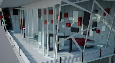
chalet over the stream

sleeping accommodation...

interior of chalet...


For that…the students will be better served by student counsellors from our College and any number of private set ups here and there. They have the uptodate info.
How I can be helpful will be perhaps to relate how it feels like to have practised architecture as a British graduate for the last 20+ years, and, I suppose, generally what it (still) feels like to be a British trained person.
In the new days when I first came back, there was a general prejudice amongst employers that Brits were on average ‘more thoroughly’ trained for the profession than others. By that ‘they’ meant that we’d been very well-groomed in ‘how to put a building together’, and would be more readily aware of the practicalities of doing the job. We actually had subjects called ‘Professional Practice’ and ‘Building Regulations’ in 3rd or 4th Yr. And, as u know, our Malaysian building regulations and fire regulations are a kinda handmedown from colonial days. The fact of the matter—our actual training and the corresponding public perception—made us feel good. In contemporary parlance, we were cool, felt cool, too.
Of course, sure, sure, some of that has changed now. And in any case any bright young woman can easily pick up those rules and constructional skills in a jiffy even if she’s never eaten the original roast beef and Yorkshire pudding in her life.
It’s changed because of the near-virtual borderlessness of the architectural flow of information and flight of pollination. Take Datum, for example: We heard from Scandinavians, Americans, Brits, Japanese, Malaysians, etc. and we all, more or less, reverberated with the same wavelengths—which means that we could just as easily get a degree from Tokyo and feel at home practising in New York or Ho Chi Minh City, no?
And it will get increasingly that way, I’m sure you’d agree.
It’s the other things, then, those things that enrich the other, larger side of us that will be the criteria, in the end.
I remember getting cheap theatre tickets every summer and frittering away all my allowances at the West End in London. (The Student Union Card did wonders for getting discounts!) I saw the original Jesus Christ Superstar, Cats, Evita, Starlight Express, Rose, Duet for One, The Romans in Britain, amongst more other plays and musicals than I can remember, sitting so near the stage you could reach out and tickle the soprano.
And standing on THAT rock in the Yorkshire Moors that Richard Gere stood on in the film Yanks… yes, that, too. And, of course, the Lake District, the northern Welsh countryside, and dipping into the Scottish stream to test my resistance to cold… All that somehow changed our skin: I mean, our large osmosis membrane. Perceptive senses. Things didn’t feel the same after that, we didn’t feel the way we felt before, or for the same things. The landscapes of post-youth, it seemed, transformed the certainties of childhood.
We were a little ‘left-off-centre’ even if we, overseas students, weren’t particularly proactive. It was in the air, the attitudes and assumptions behind every expression, be it the newspapers, tv documentaries, or the visit by Sue Slipman, the National Students’ Union president, to working-class Leeds, where I was. We were ‘surprised’ that a representative for all university students could be Red. We all read ‘Where Monsoons Meet’, published by FUEMSSO which was based in London.
Pervading this relatively strange milieu was the wonderful British humour which I love to this day—from The Two Ronnies to Not the Nine O’clock News, and much more in between, and all around. Wonderful!
And then, of course, the irreplaceable music in its home country, in its myriad variation: you could never imagine that the same word or phrase could be inflected so differently depending on locale in that tiny country. You either hated it with postcolonial vengeance or embraced it as part of humanity. I listened to the English language then, its music and its nuances. Total immersion, they call that method.
Ok la, what’s all this got to do with our objective at onset?
Well, this ‘other’ education afforded by the place, I think, on reflection, moulded a certain pliability of task-approach, a certain egalitarian slant to world views, and a certain jolly quirkiness to circumstances; and made the subsequent practice of architecture creative in the broadest sense of the word.
And I think people saw that, even if they couldn’t put their proverbial finger on it.
And I wonder if it would have been the same if I had gone to Australia.
And what does it feel like now?
It’s one of those strange experiences. You attire yourself with a garment of everlasting beauty; but come a time you realise that there are many, many others, and that you perceive its beauty only because it is next to your skin. What might have been gloriously splendid may now appear a little dated, or at best must now take its place in the kaleidoscope of fashions parading the globe. And that’s ok, Babe, that’s ok.
The other little matter (well known to all) is interesting. Students who finish in December don’t ‘lose’ any time by going to Australia, and the same applies to those finishing in June for the UK. Mix that up and you hang around for 9 months or so. Well, what’s the hurry? I did Form 6, taught the Remove for a full year, and then messed about and loafed around for the 9 months before starting 1st Year Architecture in September. I ‘lost’ 1 year and 9 months. But it was a case of seized opportunities. That year’s teaching, at that age, and that once-in-a-lifetime bingo to be a 9-month samseng were priceless.
That’s the larger education.
About the specific education, I should say just one thing: Above every criterion stands one—the tutor. The chance to work with an inspiring tutor is reason enough to go even to Timbuktu.
Hehe… says the tutor, seriously.
 Last minute preparations before the 930h show....like still preparing at 910h!
 Khang Siang bows to his stunner
 Hamilton shows the way
 Don't pose, can or not?
 Heavy stuff from Teck Hao
 "Here's how you present with sign language." (Mr Choy, Karlson & Sze Kee)
 The tall and short of it... (Chi Ming &....er..er...someone)

